STATIONARY

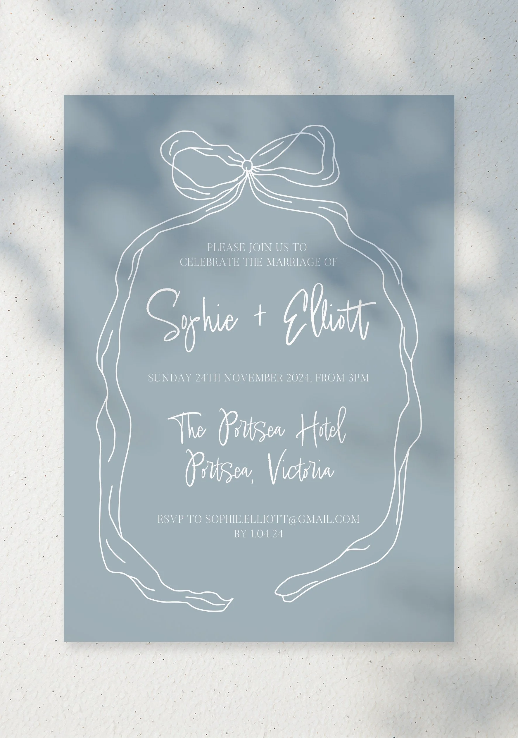
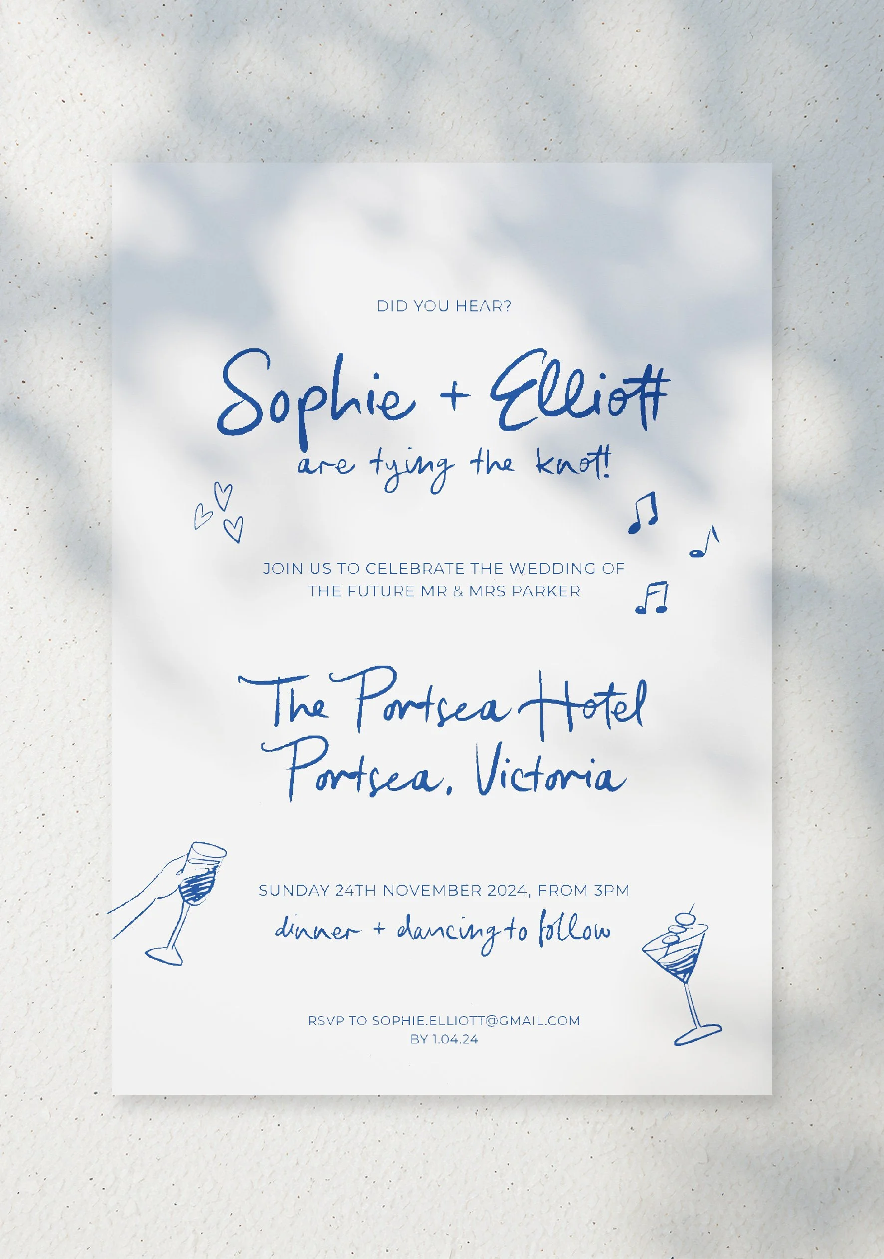
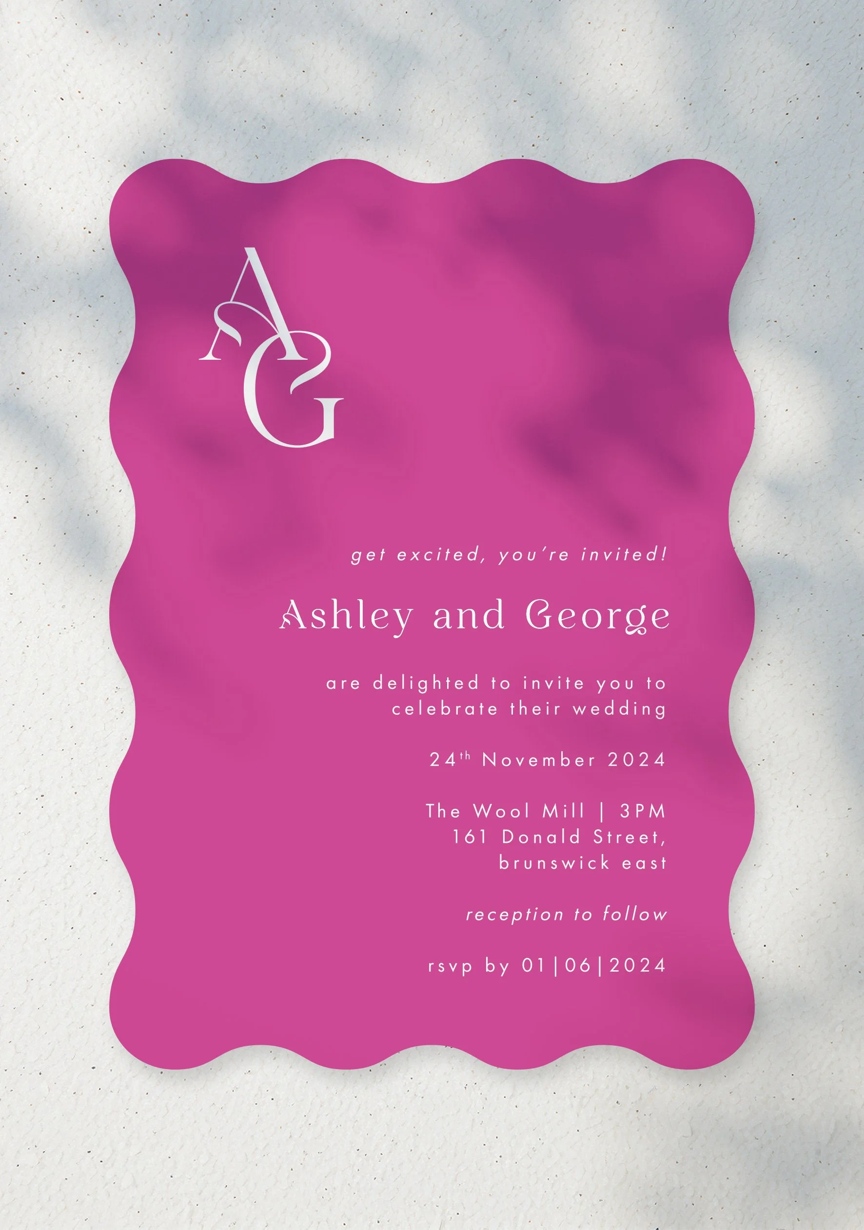
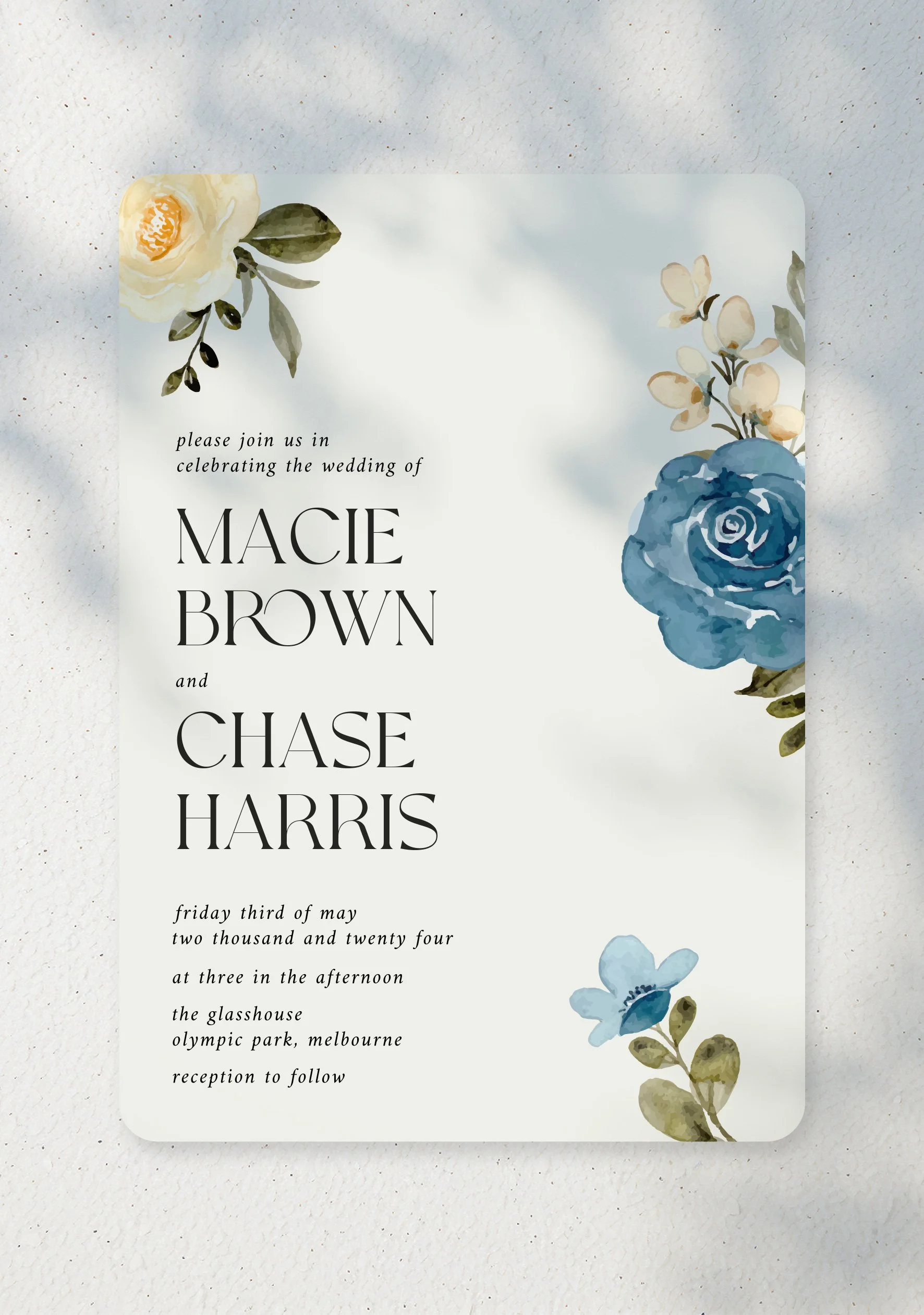
This project started in my previous role at Print On Wood, as the company was looking to expand beyond part manufacturing for other event business to running their own. This started with designing our own stationary .

The following designs are my own original concepts & they’re some work that I am extremely proud of. I found this type of work extremely exciting & naturally engaging as it came quite easily to me. I find achieving visual aesthetics to be a strength of mine so I was really pleased with how these came together so seamlessly.

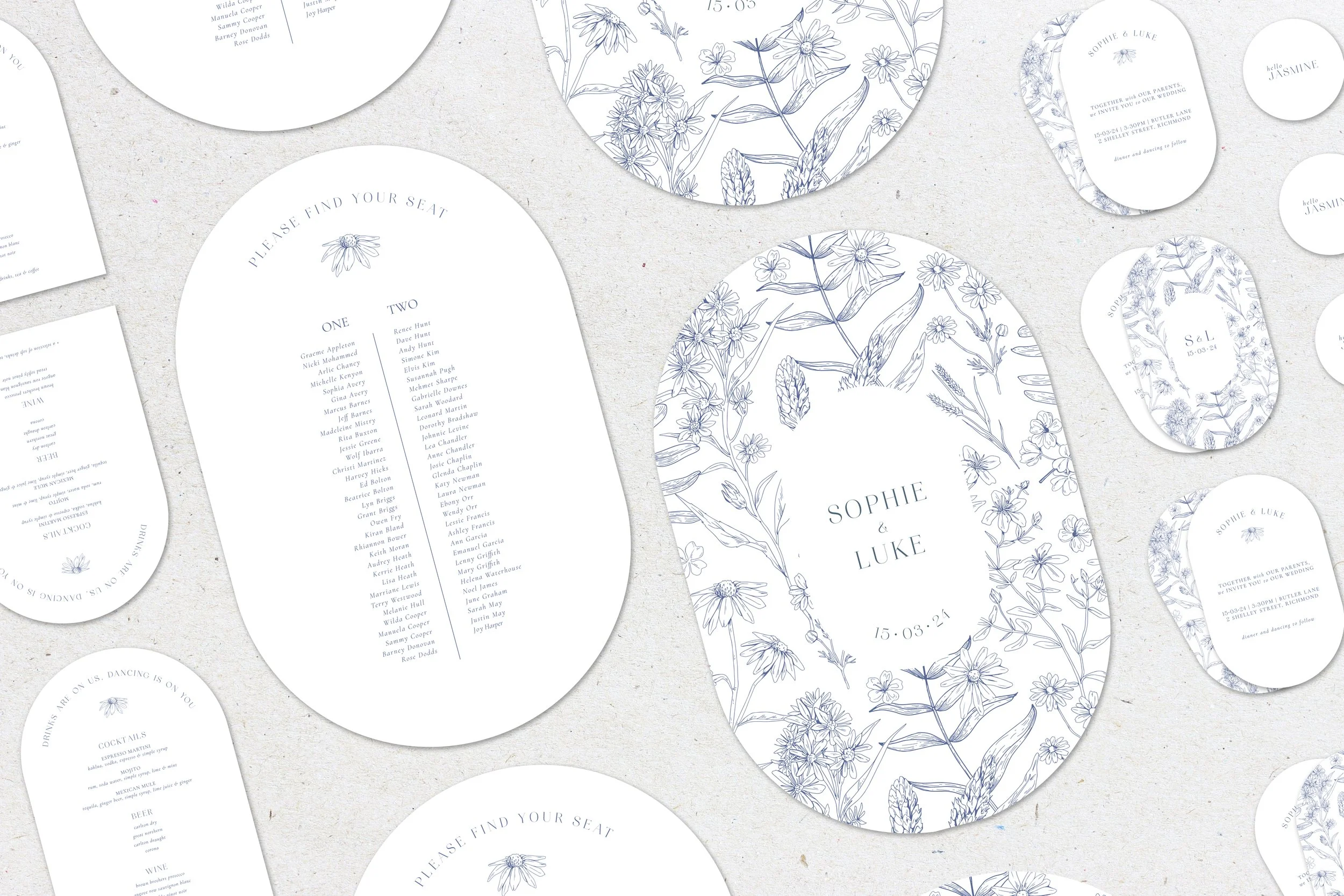
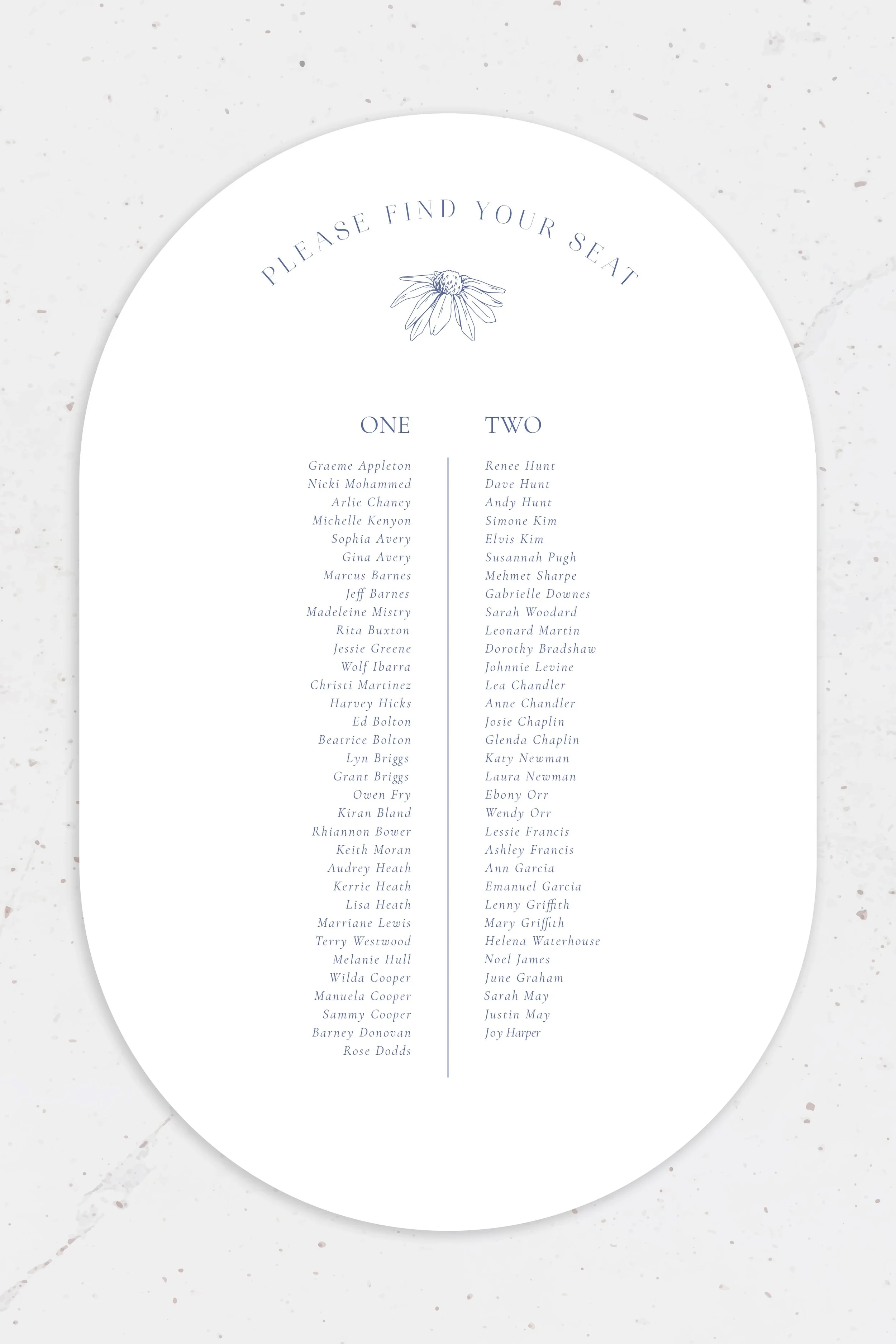
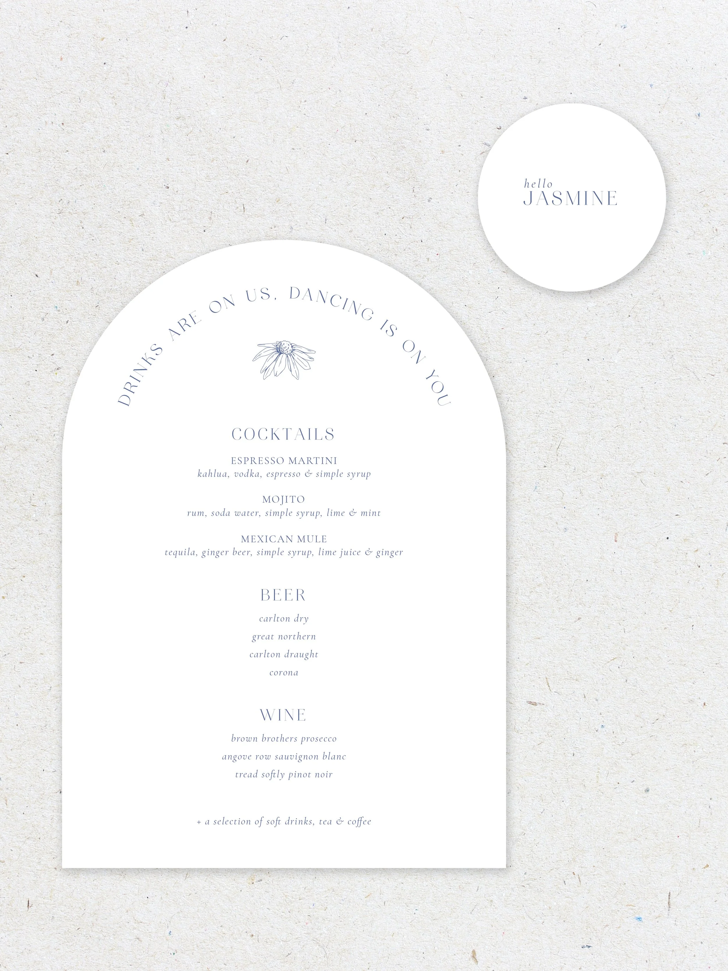
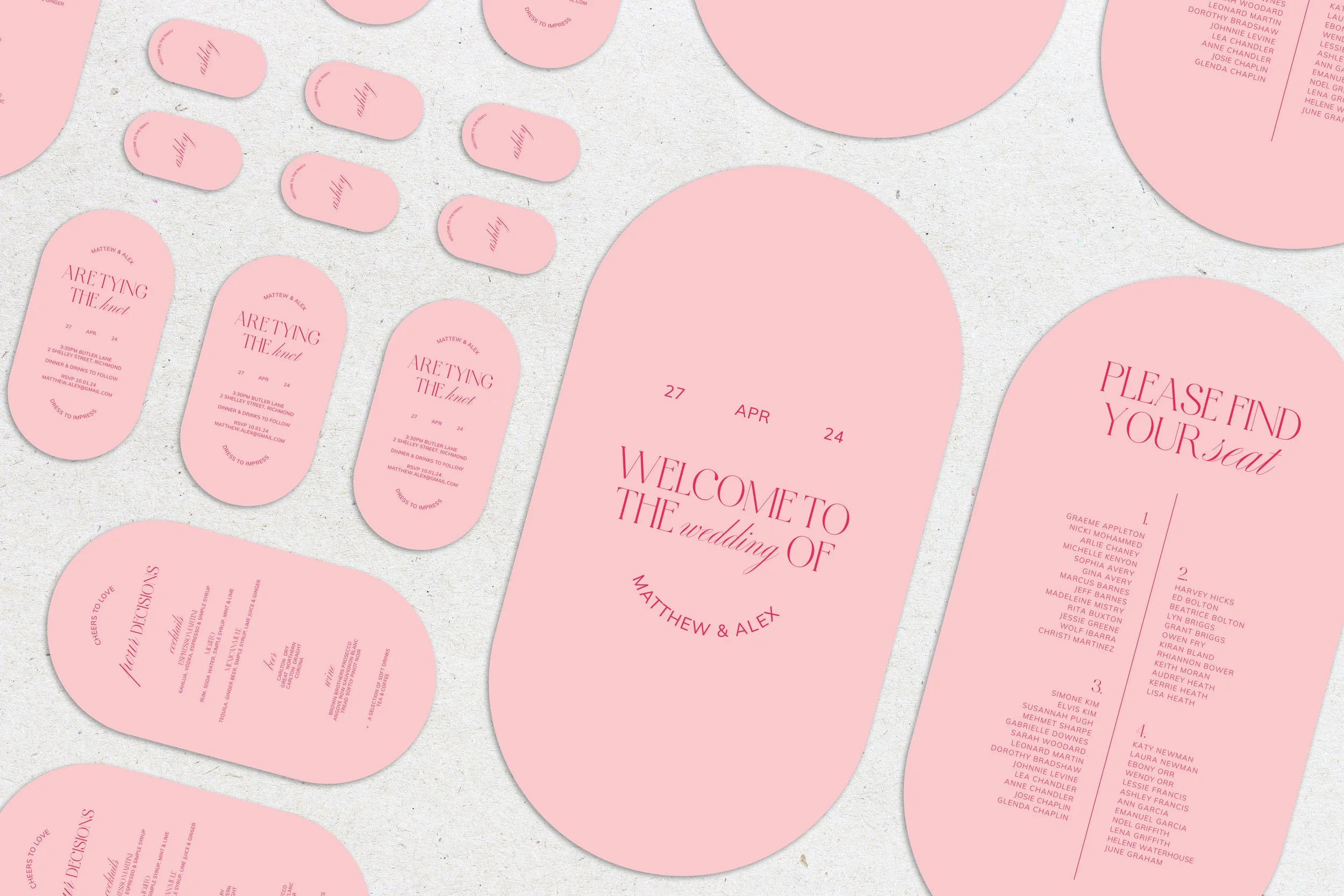
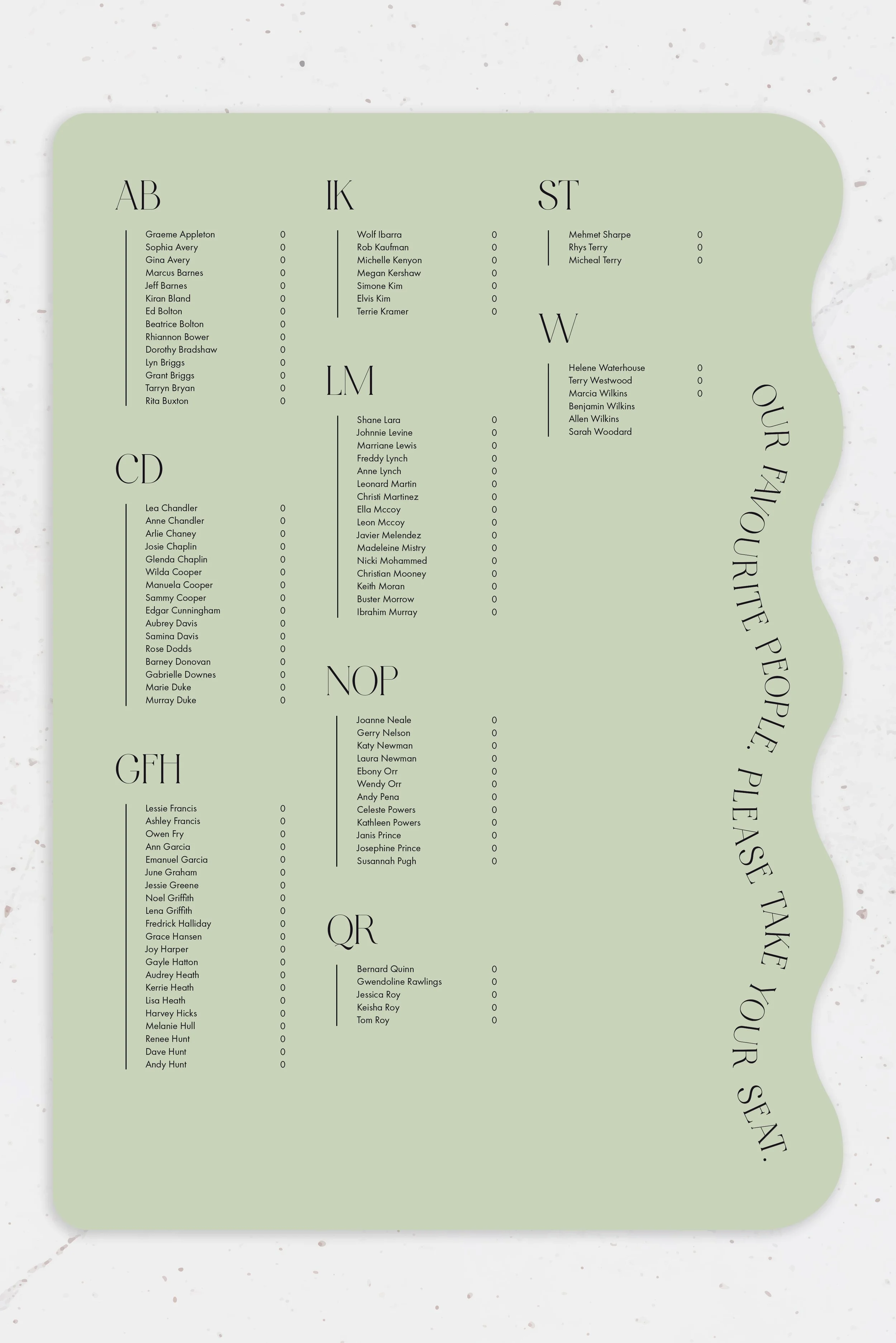
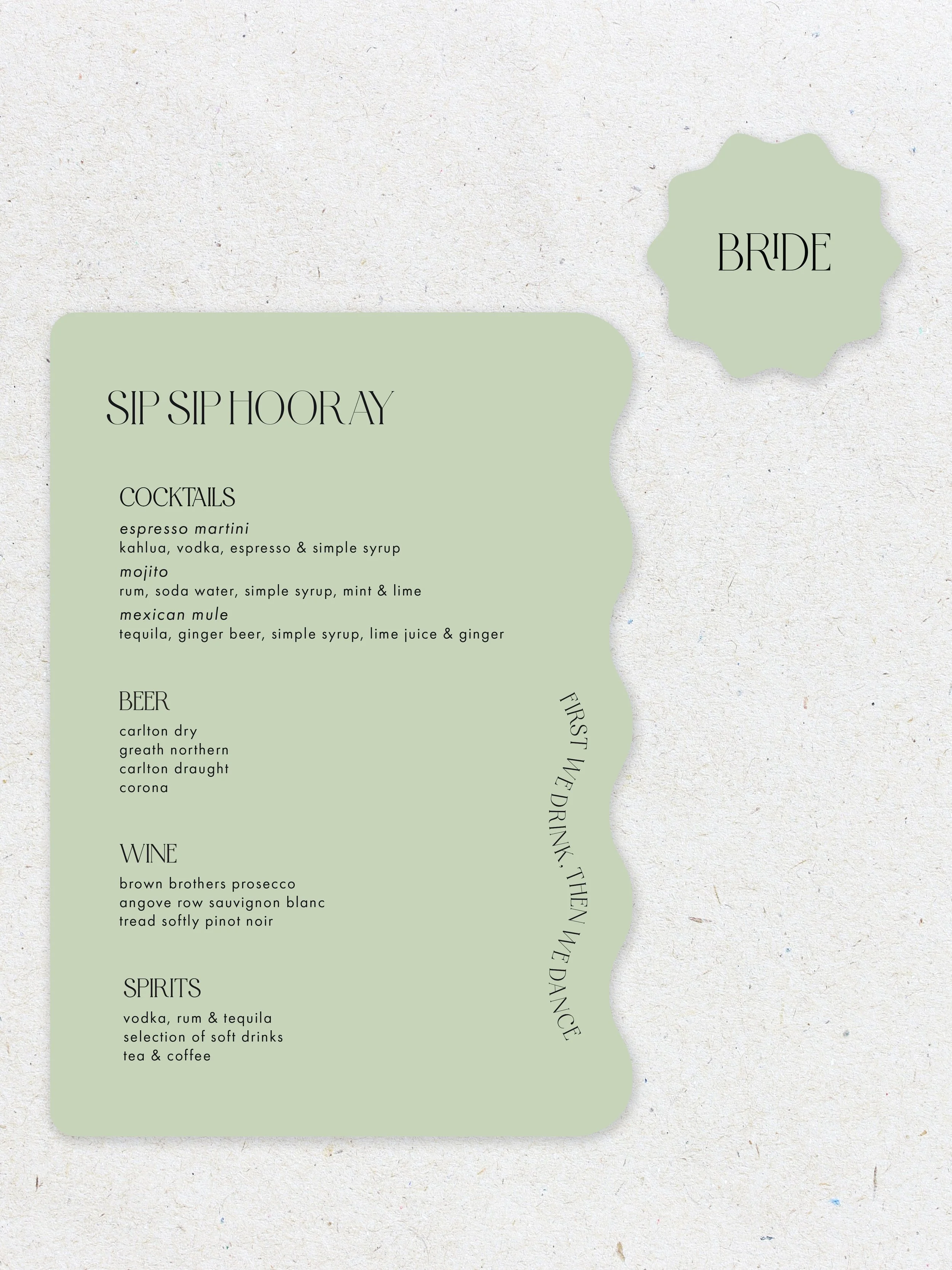
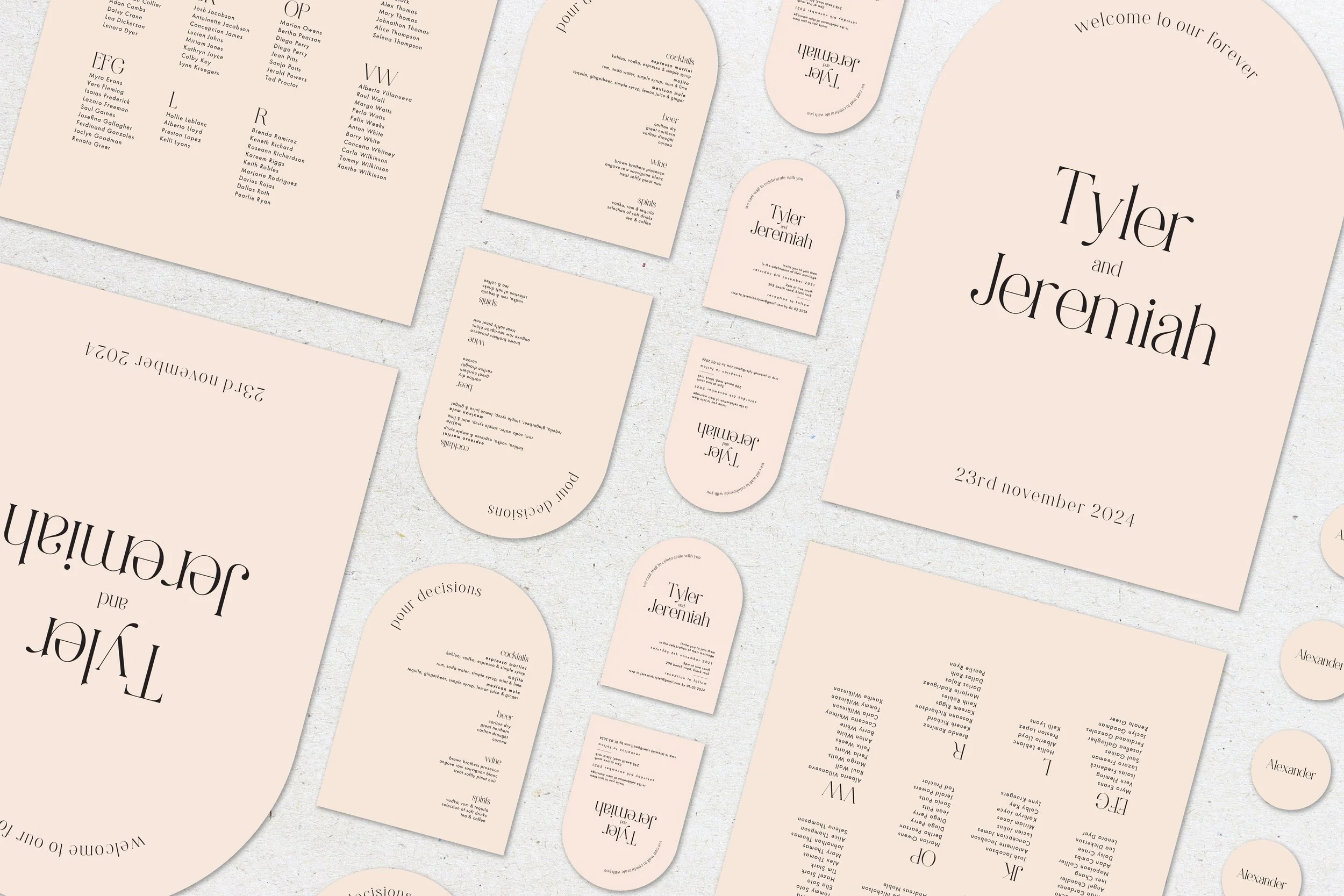
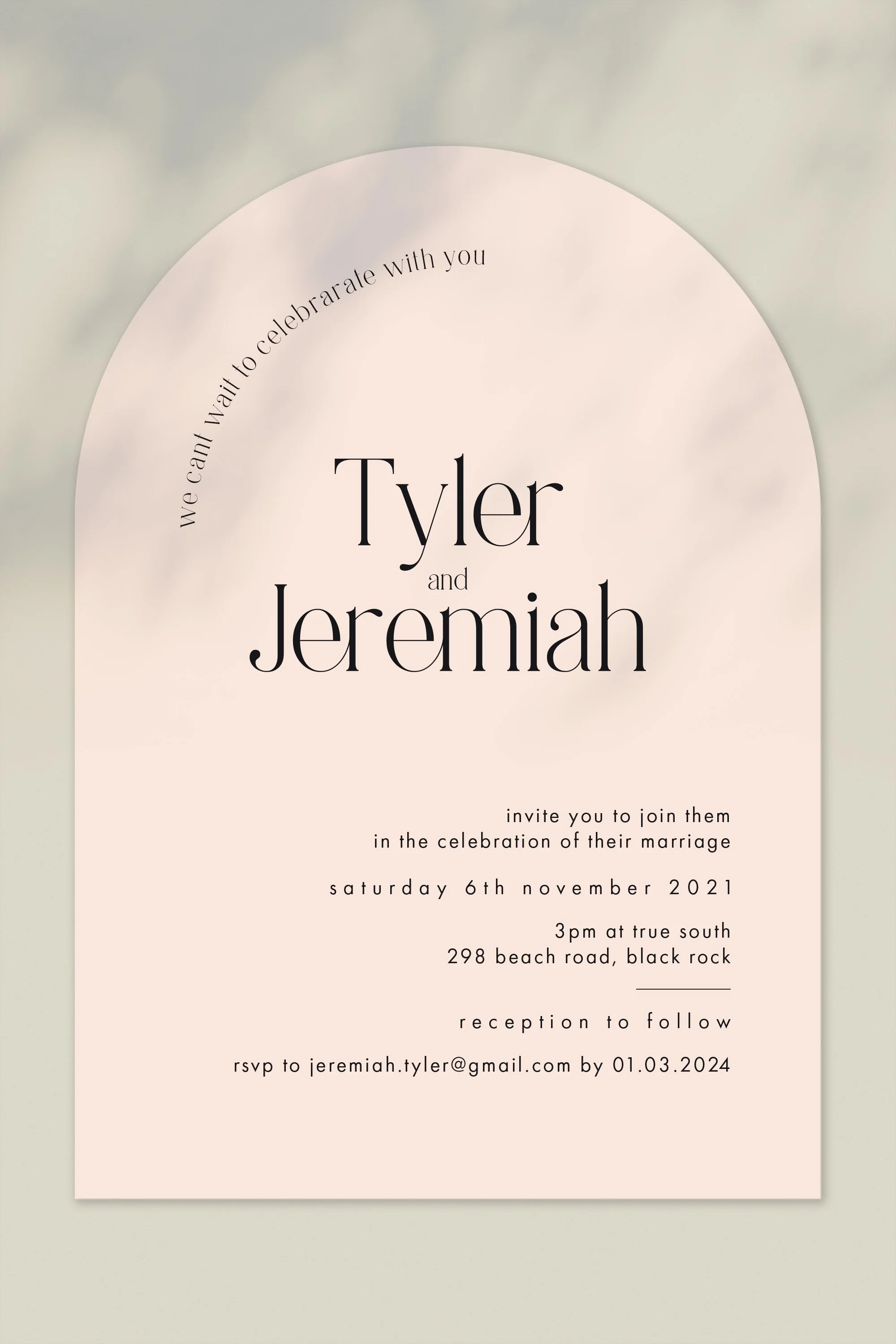
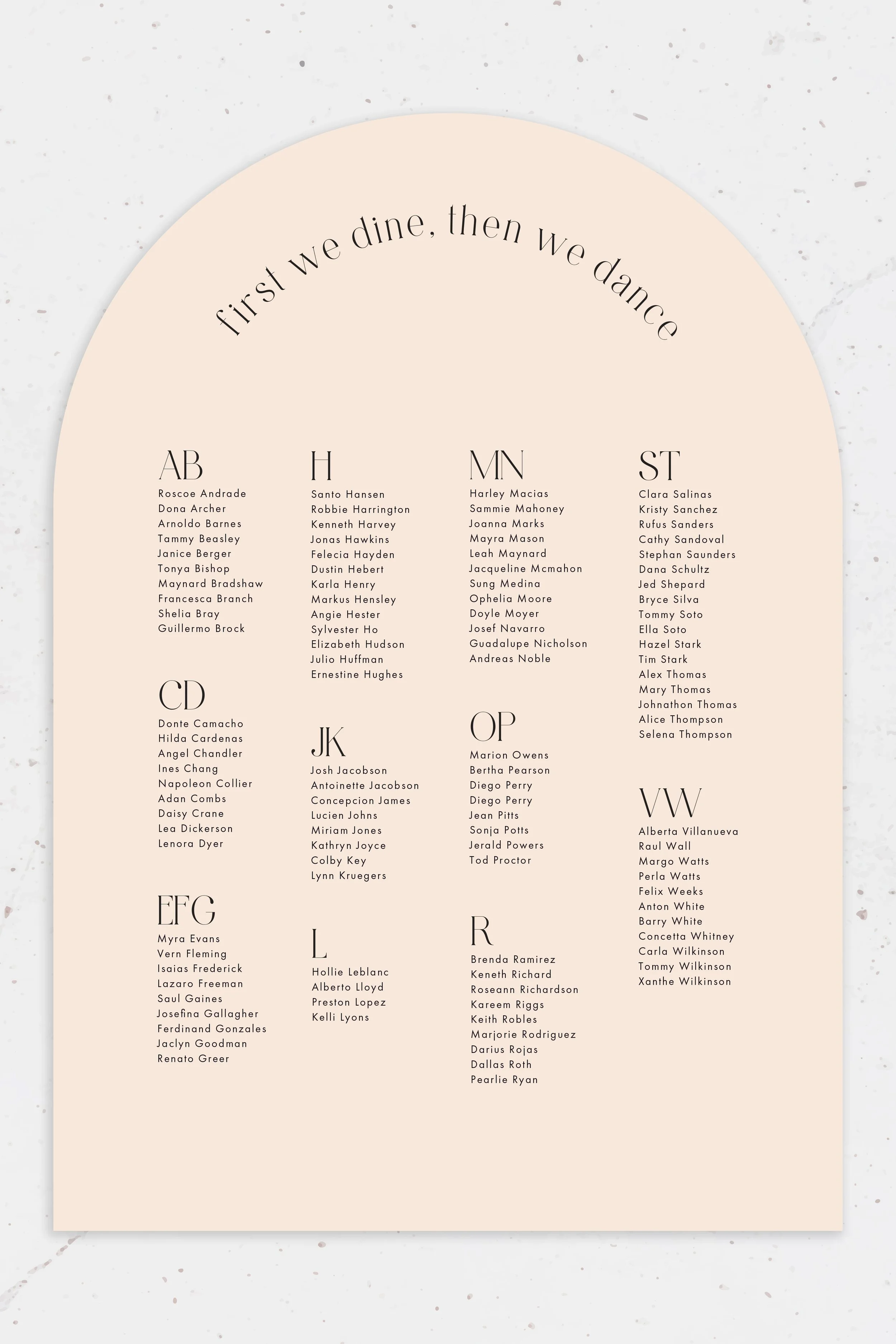
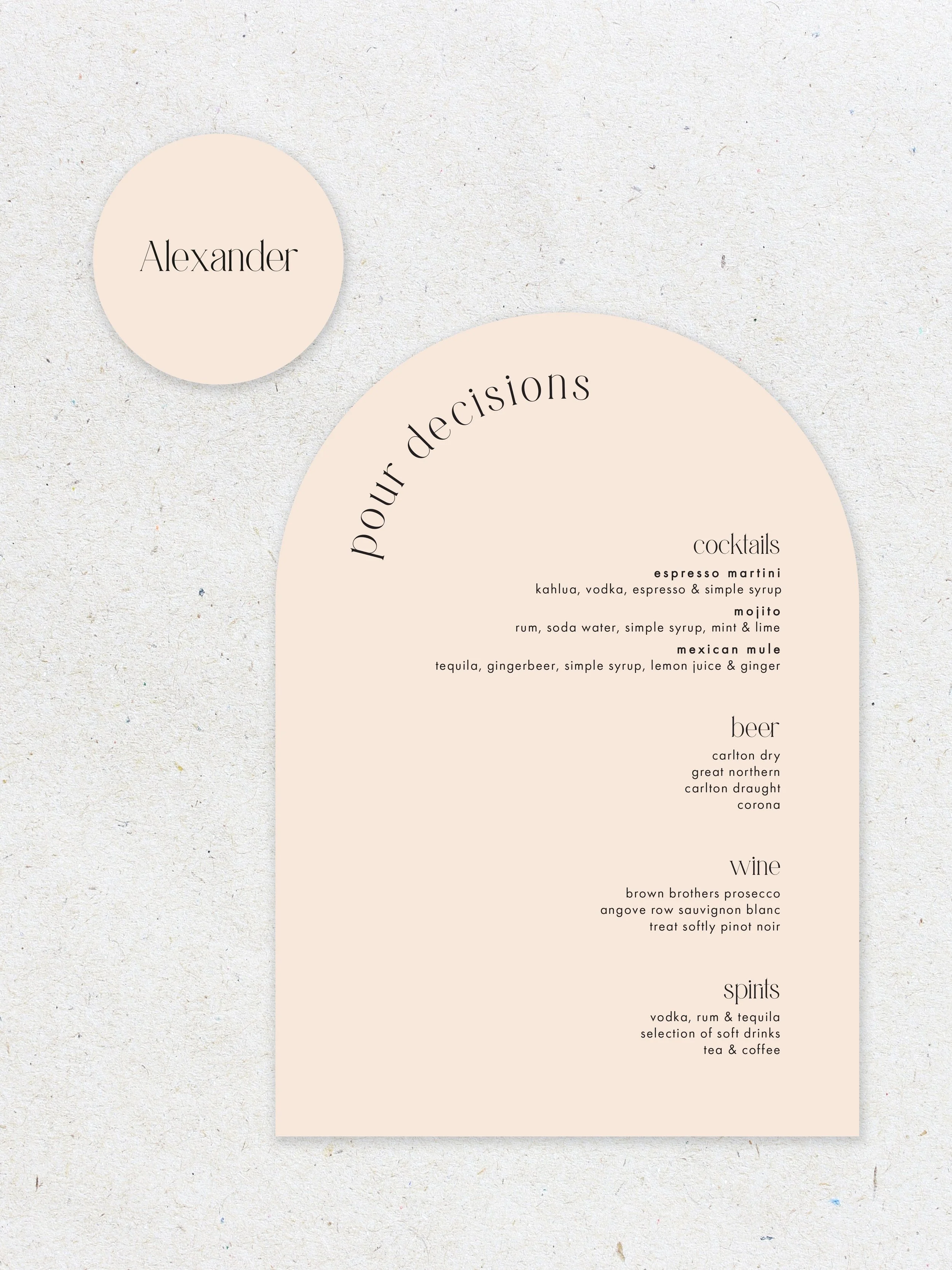
Each set has it’s own invitation, welcome sign, seating chart, drinks menu & name tag.


Botanical Dreams

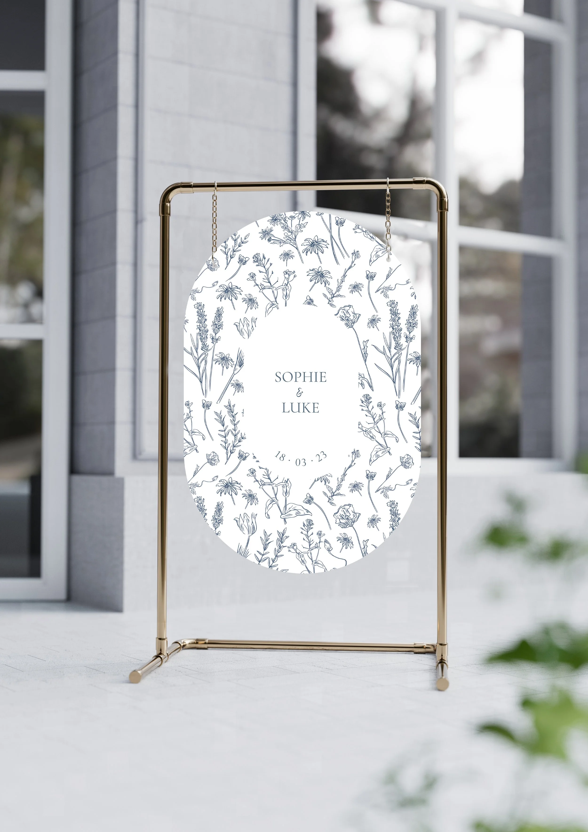
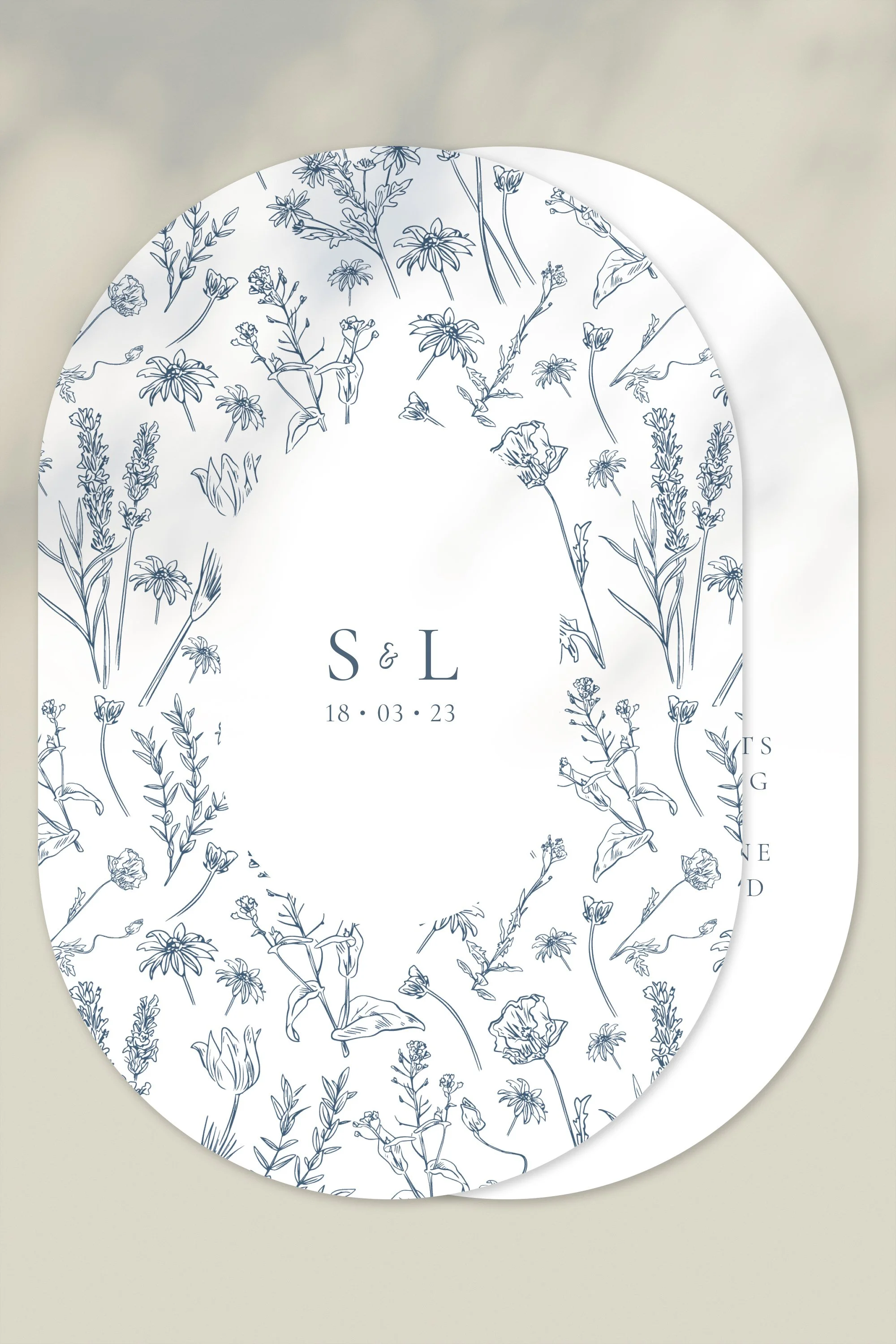
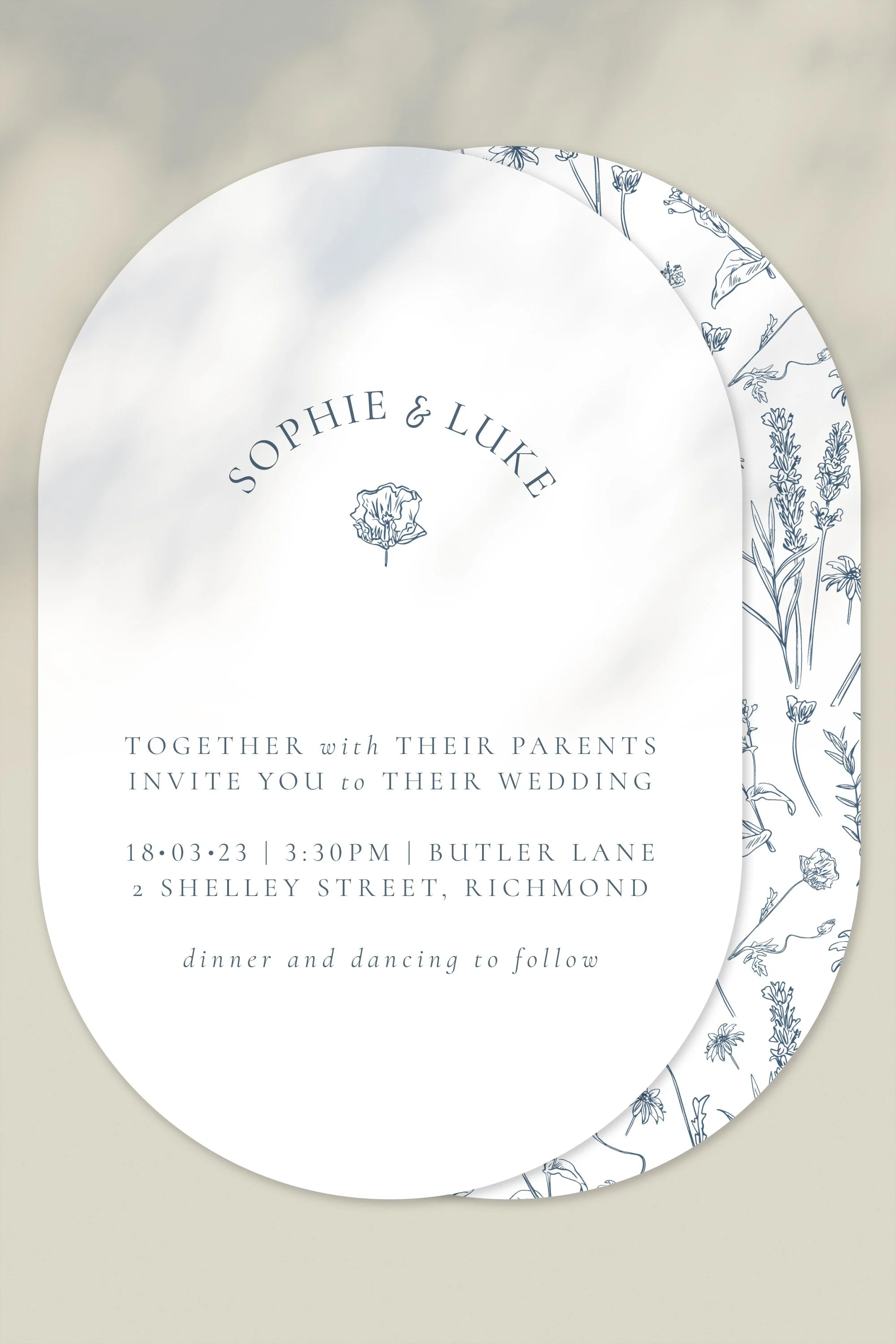
Starting strong, Botanical Dreams is the invitation that you open & say wow. Inspired by dainty repetitive florals, simple colour & this clean serif, Aire Bold Pro.

I see this design at a garden party themed wedding, something that’s definitely outdoors & maybe on the more intimate side. The botanicals could definitely be switched out to match the florals of the wedding which would just be the sweetest touch for any groom & bride.

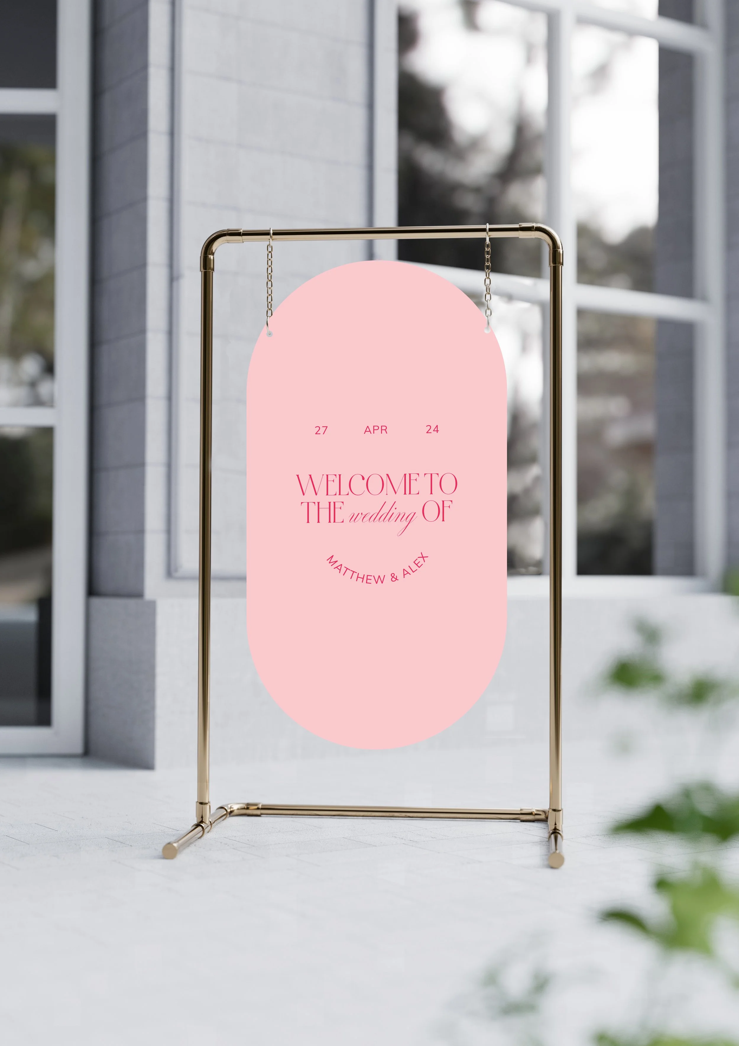
Designing a double sided invitation was really fun as I wanted to have some depth & variety across the sets so this is just something a little different! Since we’ve gone with the double arch shape, the welcome & seating sign would be hung up with some string/wire on a frame. The menus were designed to be applied vertically at the bars for guests to read but would also work individually laid flat on plates for each guest.

This double arch shape is having it’s moment right now - something a little more exciting than the standard arch and rectangle but still refined enough for those who don’t want to be going completely design-forward. A super flexible shape that compliments other ones if the bride & groom wished to combine multiple shapes for their stationary.


We Do

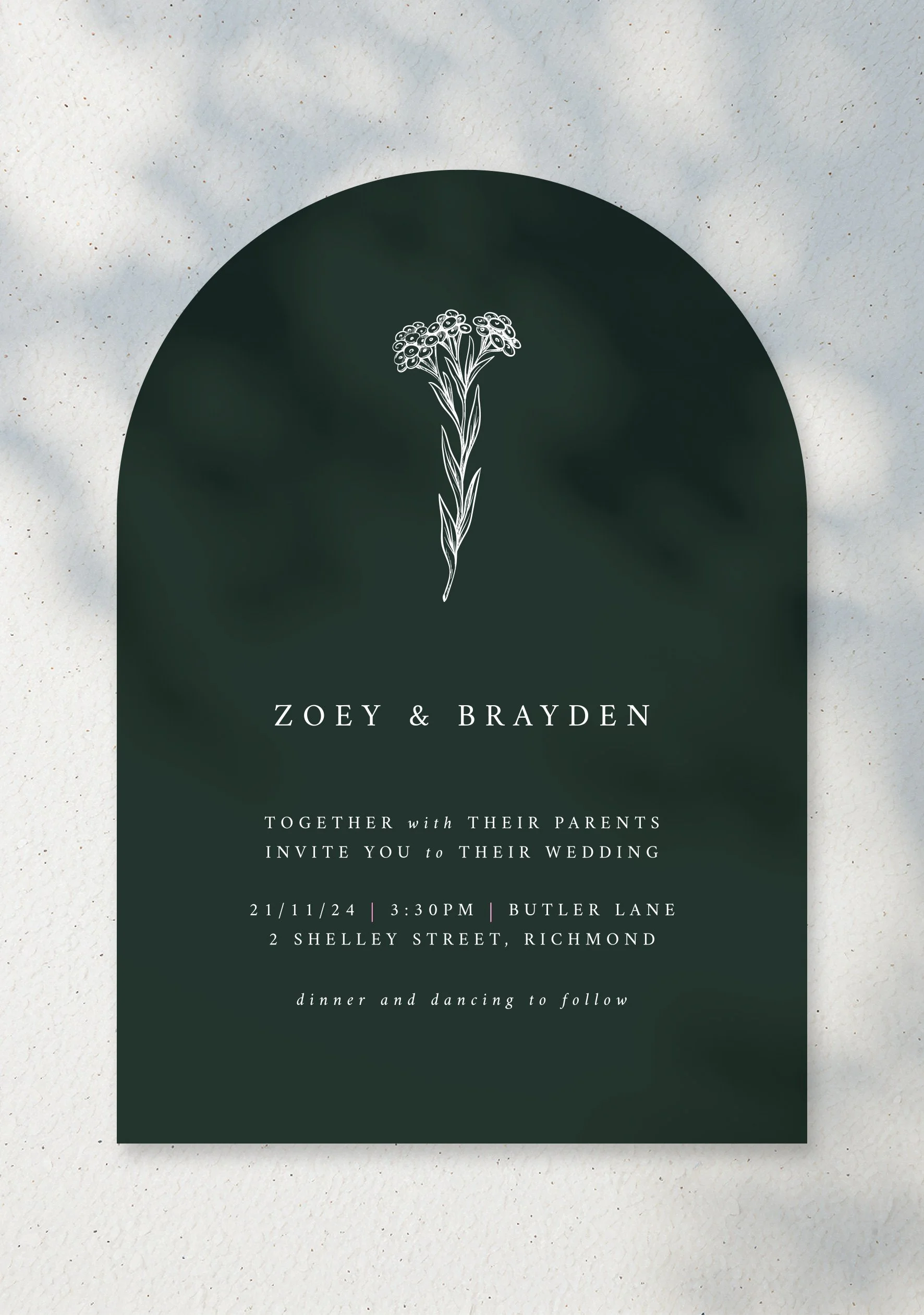
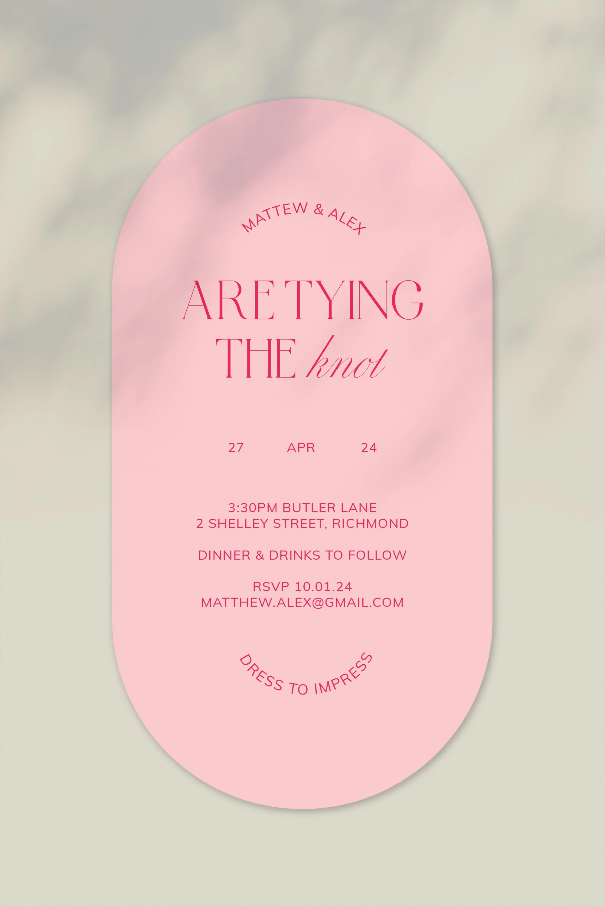
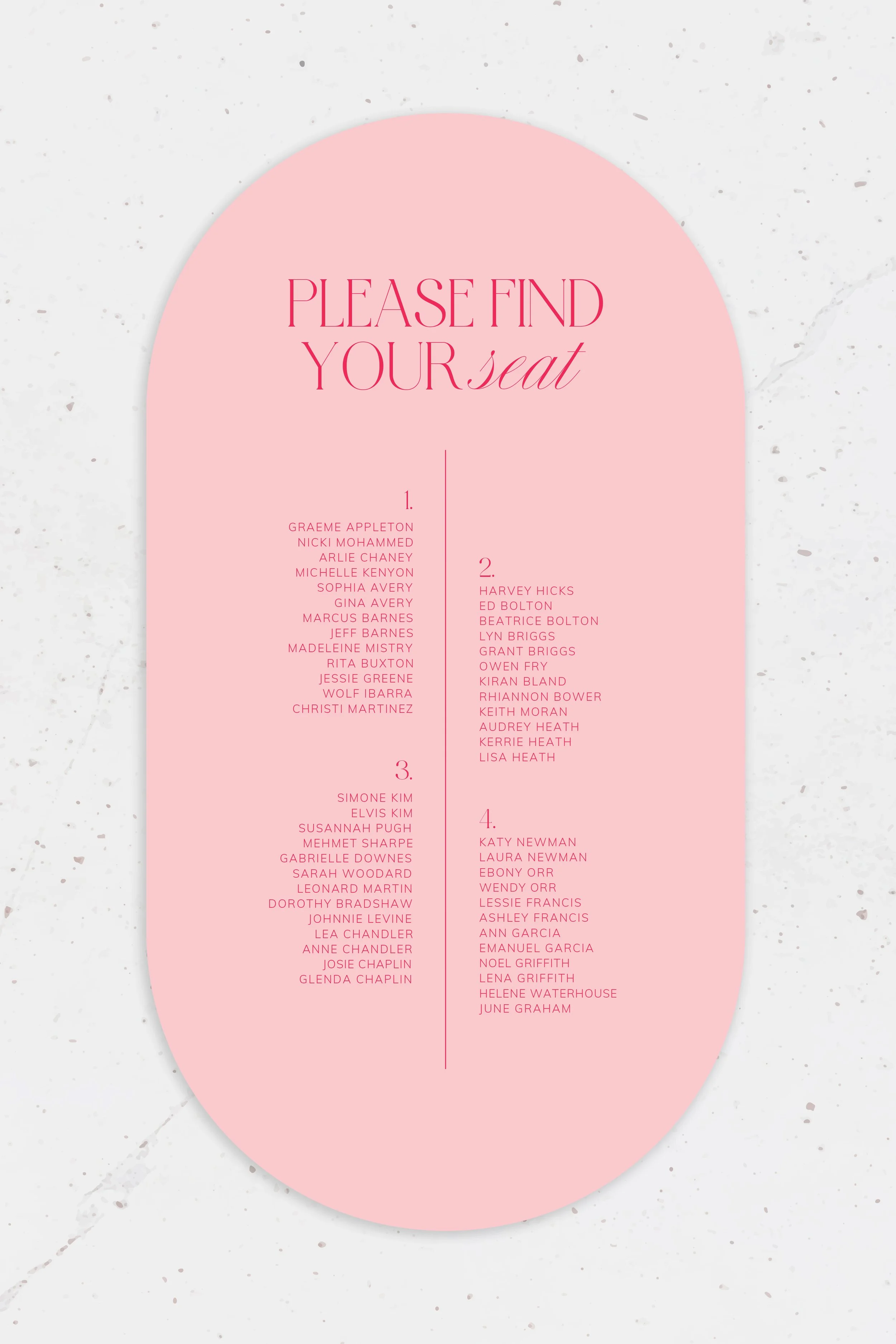
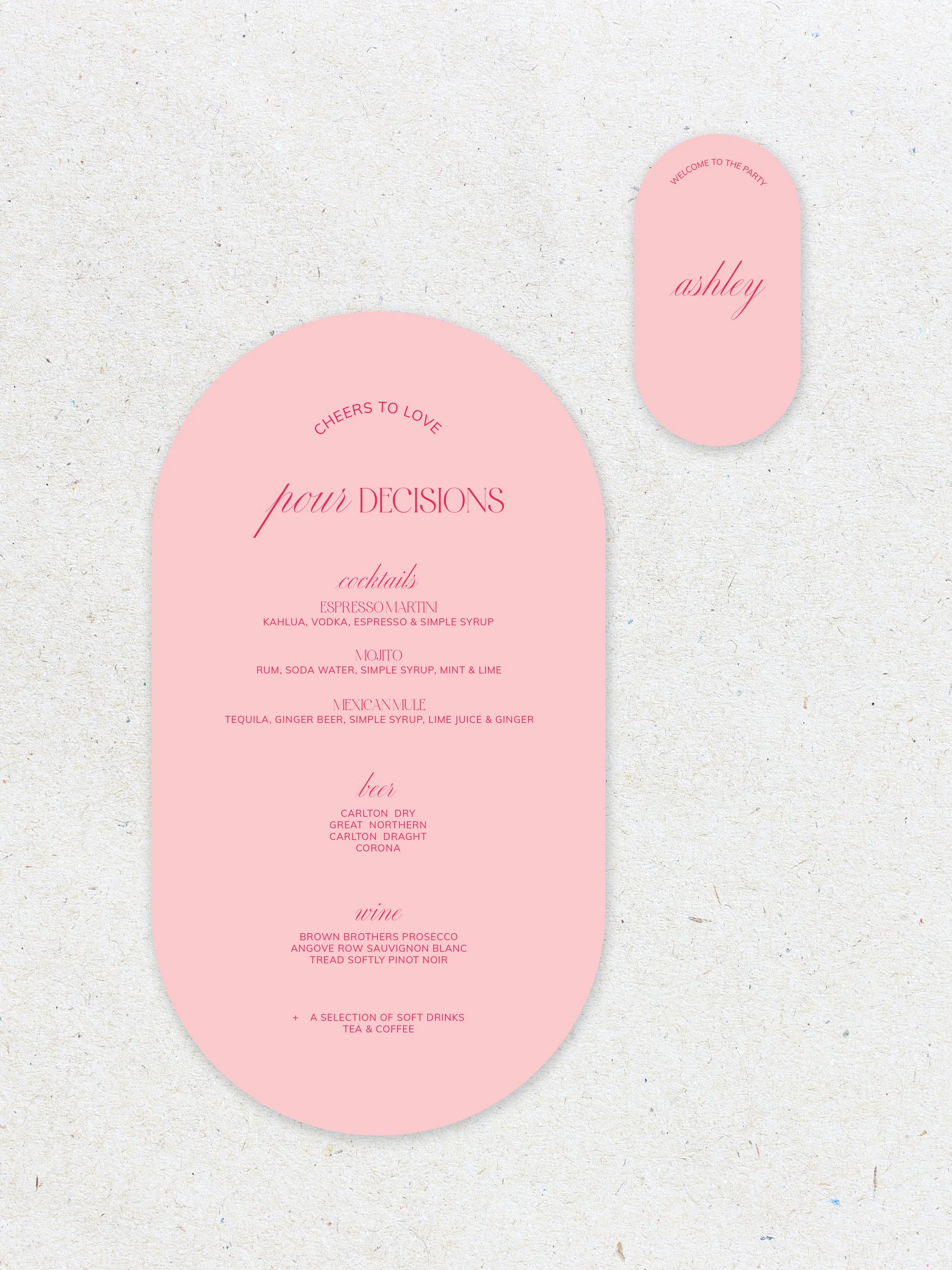
We Do is a strong contender for my favourite of the sets. Whilst there’s quite a few factors to this design, it’s balanced & is a new take on the double arch shape by being it’s slimmer counterpart.

Inspired by the recent trend of mixing typographys, I leaned into an overly cursive typeface (Medusa) to be the complimentary component to the serif typeface (Astralaga).

This concept definitely took a few more revisions to get perfect but I could not be happier with where we’ve landed & genuinely think that it’s a concept that not a lot of other wedding stationary companies are considering, which is what makes it so much stronger.

I am a huge advocate of the pink & red combo as I think they compliment each other so perfectly, so when paired with that cursive typeface this design ended up becoming quite feminine - but in the best way. To me, this is love, this is a wedding & she’s gorgeous.


Lovers Moment

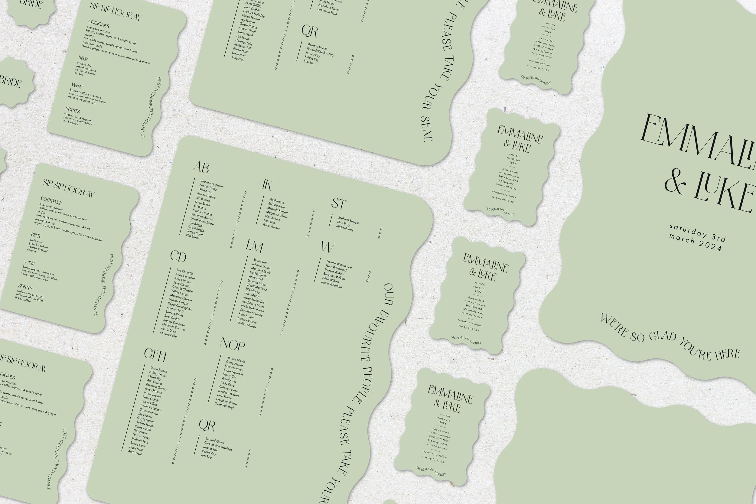
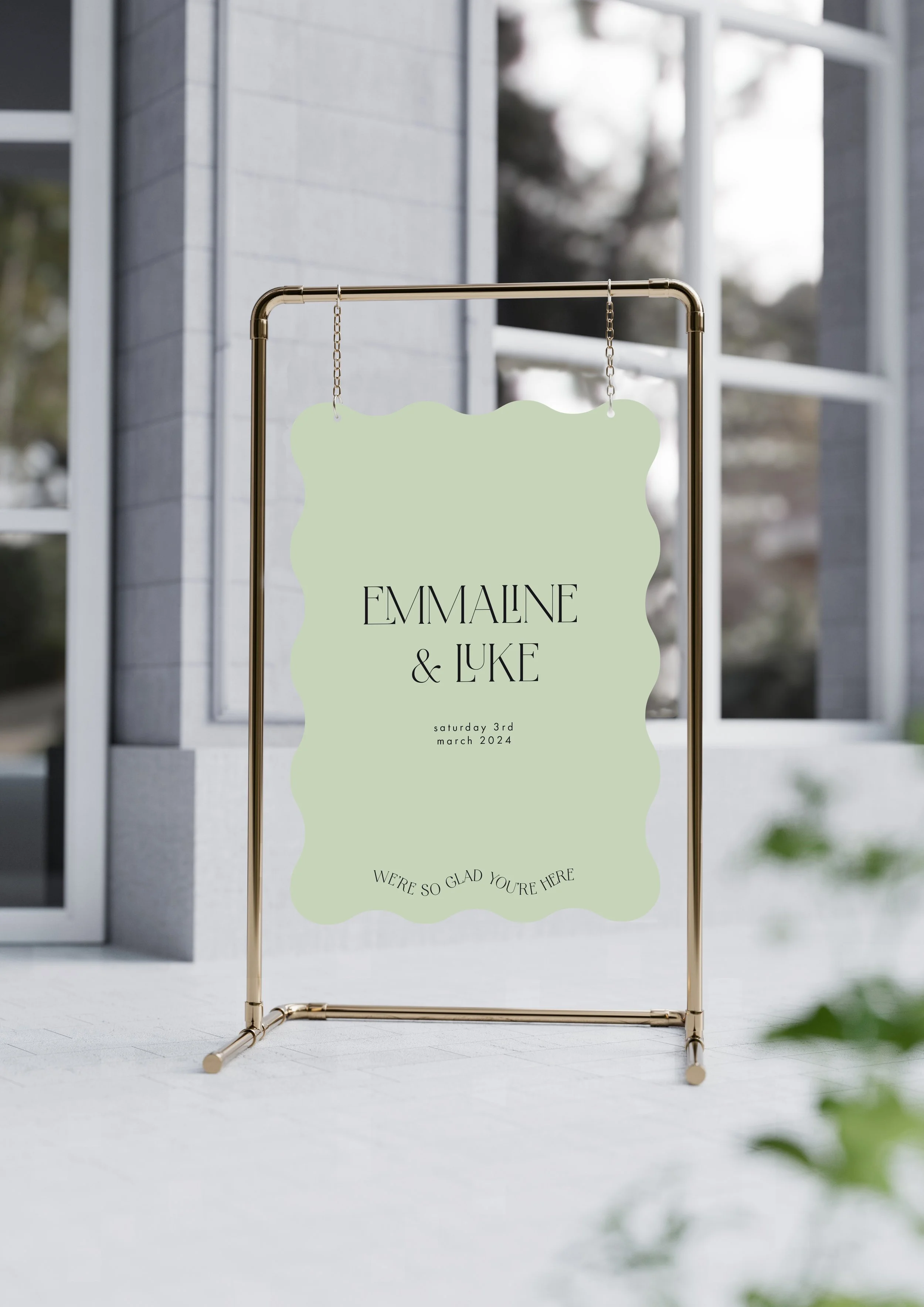
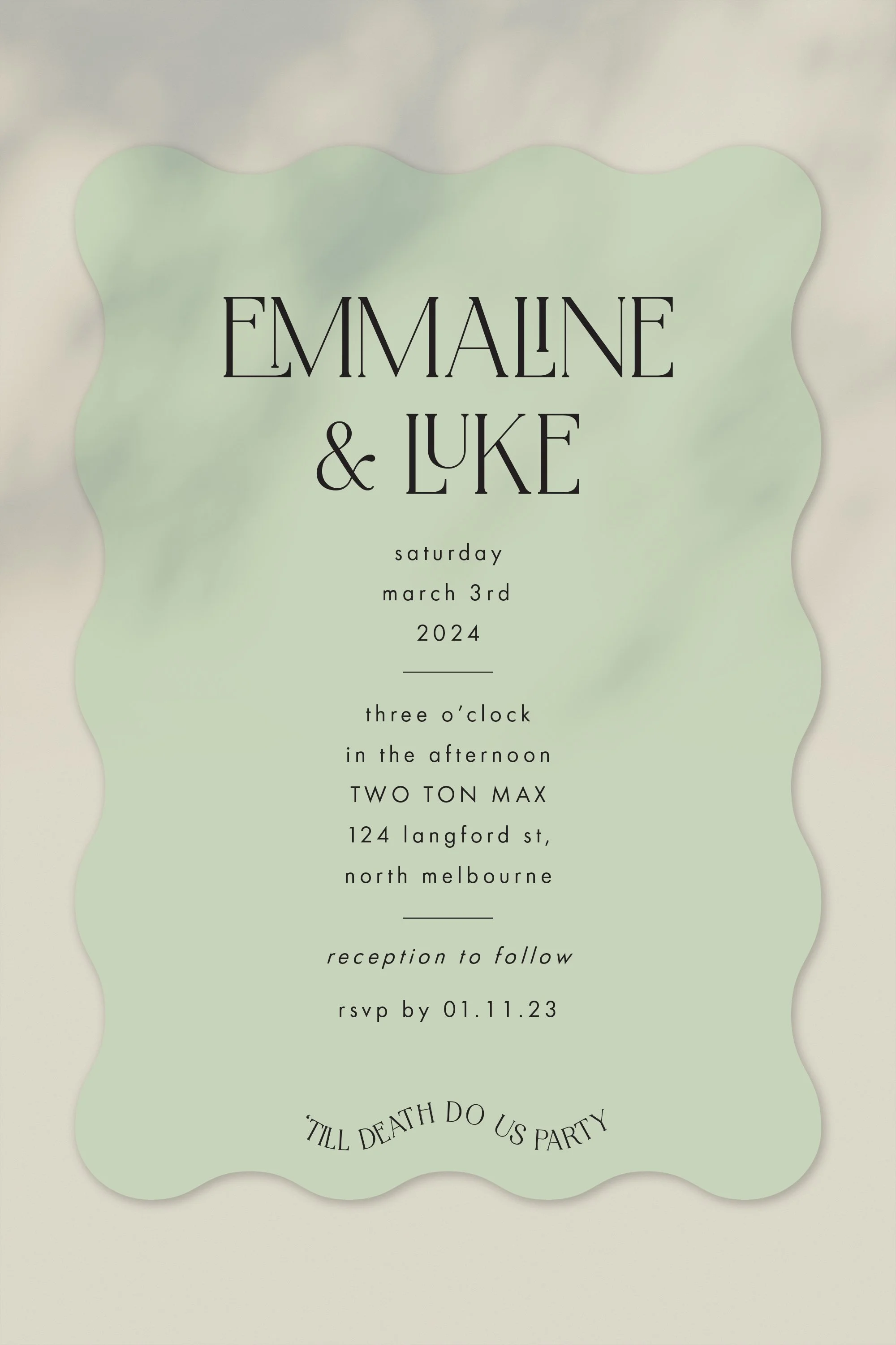
Something else that’s having it’s moment - the wave. The Lovers Moment set is a little more on the design-forward side with intricate typography that follows the curve of the signage. It’s a set with it’s own little quirks that would also look amazing in a more lowkey colour palette.

Lovers Moment is for the brides & grooms that want to add colour into their wedding. They’re not following traditional wedding customs & are looking for something as unique & special as they are! The star of the show is this gorgeous serif typeface, Astralaga. It has some stunning glyphs that I’ve been able to utilise which definitely contributing to its wow factor.

It’s got some shapes that are the complete wave & some that only have 1 side being the wave but this design would also work in any shape - I’d just be keeping the paths of the sayings in line with the desired shape.


Fine Loving

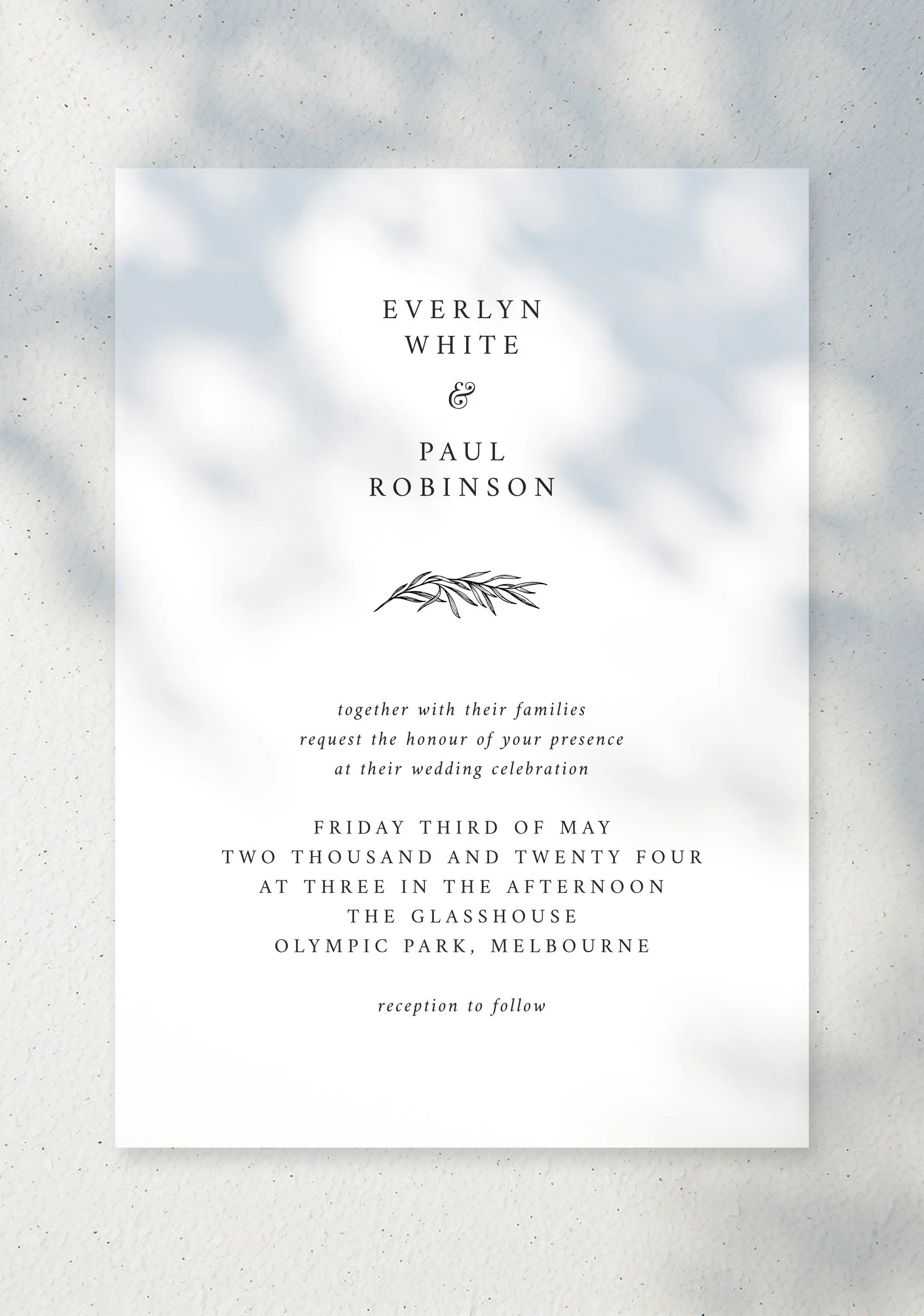
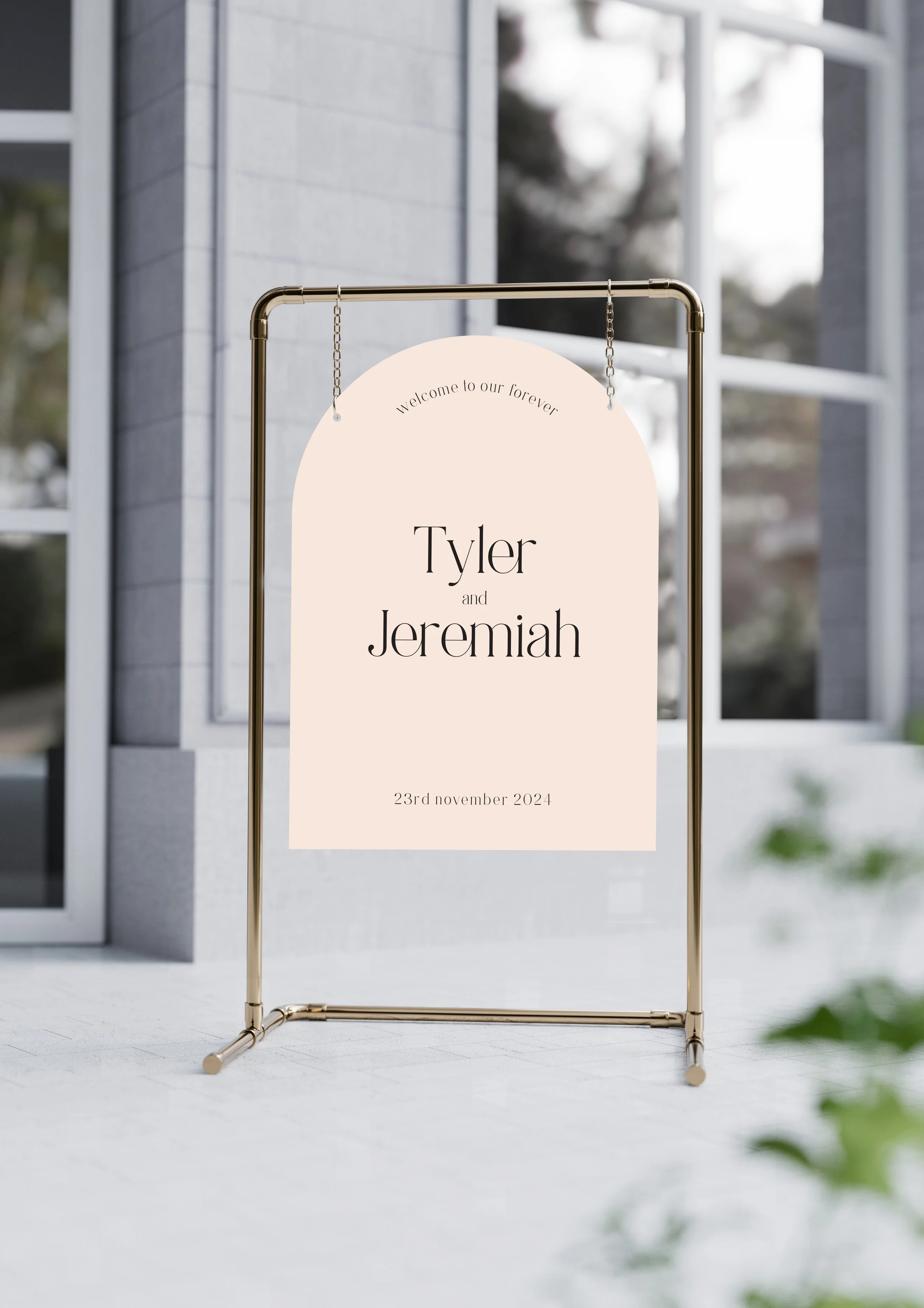
Fine Loving is my people pleasing design. Not everybody is going to love colour & intricate typefaces & design-forward layouts like I do, which is where Fine Loving comes in. It’s exactly what I’ve named it to be - lovely & on the simpler side, for my more minimal brides & grooms.

Adding a touch of detail with this typeface that has some connecting glyphs which have been super popular as of late, it’s a beautiful but still simple approach to round out the designs & show that I can nail the simplicity just as well as the wow.

Fine Loving is also compatible for other shapes which was a major focus for all of the designs as I wanted them to be flexible for all brides & grooms, making the designs unique like them. In this edit, I’ve gone with the arch as it’s a classic for a reason.

Previous
Previous

MIXED MEDIA – THE HERTZ GROUP

Next
Next

Packaging